Google's new Gmail widget highlights issues with iOS widgets
Google's new Gmail widget highlights issues with iOS widgets

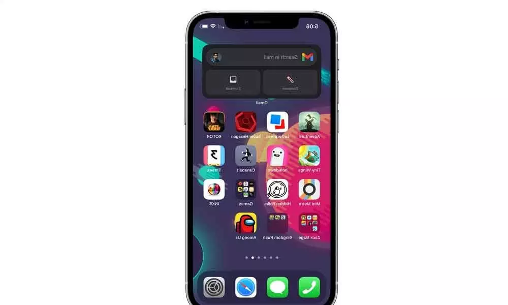
Google's Gmail app has been updated for iOS 14 with a new widget, but it's probably not the kind of Gmail widget you were expecting.
At present, there's only one Gmail widget for iOS 14 that only does one thing: offer quick links to your inbox, compose menu or search. There is no actual preview of the contents of your inbox, no ability to sort mail by archiving or deleting without opening the app, and no way to read an incoming message. The most interactive element is a simple "unread" counter, something that the application icon has already been able to do for years.
Part of that is on Google; other email applications, like Spark, have created more robust widgets. But a large part of the blame falls on Apple's shoulders, with its strict limitations on what iOS widgets can do. Especially, Apple widgets are designed not to be interactive. That's why you can't mark to-do list items in a reminder widget or why the Spotify or Apple Music widgets don't offer play and pause controls.
As the company's developer guidelines note: "Widgets present read-only information and do not support interactive elements such as scroll elements or switches." Apple offers the option for developers to allow widgets to be kept up-to-date by regularly updating in the background. Still, it is a long way from allowing truly interactive elements.
Apple may compromise on what it allows developers to do with widgets in future versions of iOS; iOS 14 marks only the first iteration of the feature, after all. But unless the company completely changes course on the kind of functionality it envisions widgets to provide, it looks like we'll be stuck with these more limited widgets for the foreseeable future.

