Live
- Oppn misleading people, says PM
- Telangana CM Revanth Reddy Suggests Prioritizing the Most Needy for Indiramma Housing Scheme
- Telangana School Holiday: SFI Announces Bandh on November 30 Over Food Poisoning Cases
- NIT Warangal Library Trainee Recruitment: Last Date for Applications Tomorrow
- Singareni Recruitment 2024: Notification for 64 Internal Job Vacancies Application Deadline Announced
- A Teenager's Fight for Justice: Hyderabad Court Sentences Father to Life for Heinous Crime
- The Role of AI in Diagnostics, Treatment, and Patient Care
- Freshers’ Day Celebrations at Palem Agricultural Polytechnic College.
- Pearl Academy and Tech Mahindra Collaborate to Establish Makers Lab in Bengaluru
- “The Best Time to Start Retirement Planning is Now”, Says HDFC Life’s Latest Campaign
Just In
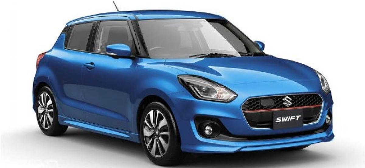
It has been a decade and a half since Suzuki’s Concept S first broke cover. The first – rather outlandish – concept paved the way for a subtler,
We Take An In-Depth Look At The Design Of The New Swift!
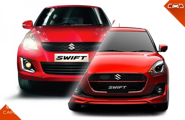
It has been a decade and a half since Suzuki’s Concept S first broke cover. The first – rather outlandish – concept paved the way for a subtler, more mass-production friendly looking Concept S2. Back in 2004, the Suzuki Swift was born, borrowing heavily from the S2. In its final avatar, the super mini from Suzuki was easy on the eye, chic and most importantly – cool.
And, that’s exactly why it clicked with the masses at large. The Swift made a solid first impression, which drew people to showroom floors. The curvy lines, stubby nose, the sloping roof-line, and the blacked-out A-pillar stood out as little details that made the package wholesome. The facelift that debuted close to half a decade later, adopted an evolutionary approach. The recipe remained the same, as Suzuki chose to play safe. Evidently, the design played a pivotal role in the Swift’s success. Which only makes things slightly difficult for the new kid on the block, doesn’t it? For it has to live up to two blockbuster generations. Has Suzuki managed to retain the essence of the Swift in its latest iteration?

Change is a good thing!
Has Suzuki played safe yet again? Not entirely. The Swift’s crisp shoulder line has given way to a smooth flowing surface, evidently based on the ‘Liquid Flow’ theme we first saw on the Baleno. It is most noticeable when you view the car from the front three-quarters. The soft yet dominant lines on the bonnet, paired with the flared and flowy wheel arches, make the Swift be as chic as ever.
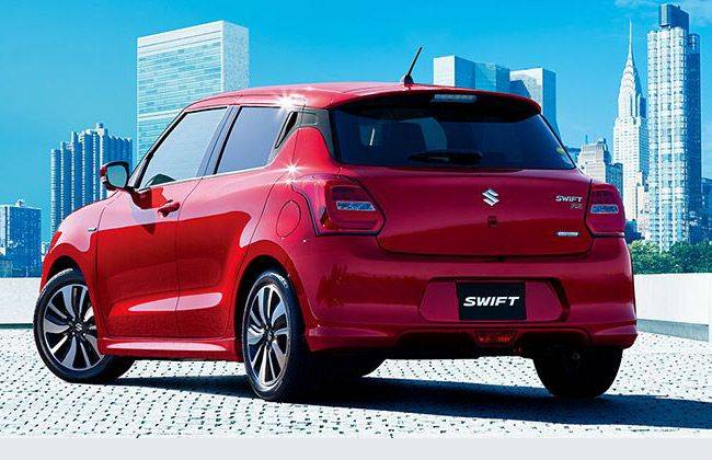
What stands out from the side is the second (and more prominent) character line, which emanates from the middle of the front door and arches over the rear wheel-well. Personally, I particularly like the ‘sine-wave’-like character line that runs from the headlamp to the tail lamp. The same line ‘flows’ over onto the rear hatch door, connecting the tail lamps in the process. The character line on the hatch is pronounced, giving the boot a pinched look.
What’s different?
Everything. Every single body panel is completely different when you compare it to the outgoing generation. Here’s a snapshot of the big changes:
The Snout
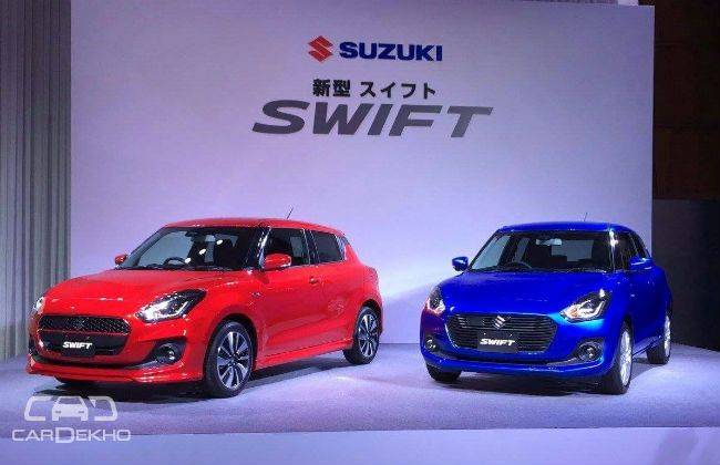
The Swift has always had a smiling and affable face. The older generations featured a slender grille coupled with large airdams on the bumper. Not any more! It now features a ‘snout’ that houses a protruding hexagonal grille, and a sleek C-shaped airdam near the base of the bumper. There’s a hint of aggression to the face, which was never the case with its predecessors. What adds to the angry flavour are the redesigned headlamps that now feature a projector set-up and daytime running lamps.
Sizing Up
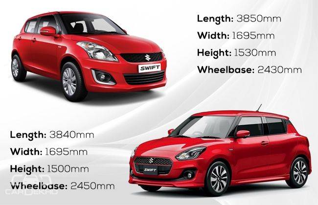
With the new iteration, the city-friendly proportions have been retained. The width remains identical, but the length has been chopped off by 10mm. Interestingly, the wheels have been pushed further out towards the edges, giving the Swift a crucial 20mm of extra wheelbase. We reckon this should make the cabin a tad bit roomier.
The Little Details
- Just like its predecessors, the A-pillar has been blacked out. To add to the ‘floating roof’ effect, a portion of the C-pillar gets a dose of black as well.
- The rear door handle has been moved next to the window, which makes the Swift look like a two-door hatch. The black door handle flows well into the C-pillar which in turn merges into the rear windscreen, giving it a wraparound feel.
- The RS variant adds a sporty body kit, and hexagonal detailing on the grille. Base versions of the Swift feature simple horizontal slats instead.
- The sloping roof gets a sharper rake, resulting in a 30mm drop in height.
What’s the Indian version going to look like?
Nearly identical. We do expect Maruti Suzuki to layer a bit of Indianness (read: chrome) on the Swift, especially on the grille and the hatch door. Other India-specific details are likely to be 15-inch alloy wheels (Japanese-spec = 16-inch) and a raised ground clearance, which should be on par with the current iteration at 170mm (Japanese-spec = 125mm).
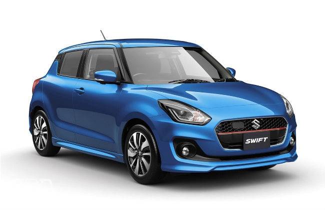
Maruti is likely to offer the ‘iCreate’ customisation pack for the new Swift as well, which is likely to include a contrast-coloured roof, wing mirrors and wheels. Just like the upcoming Ignis, a range of different roof wraps might be offered as well.
When can I see one in person?
Before the end of this year. Maruti Suzuki will unveil the new Dzire first, and then take the wraps off the new Swift for India. We’re expecting a launch by mid-2017, with prices going slightly north thanks to the bigger equipment list.
Source: cardekho.com

© 2024 Hyderabad Media House Limited/The Hans India. All rights reserved. Powered by hocalwire.com


