Live
- AP Dy CM, assembly speaker condoles death of former MLA Nara Rammurthy Naidu
- Senegal wraps up campaigning for legislative elections ahead of vote on Nov 17
- Free Study Materials Distributed to Needy MBBS Freshers by Seniors
- Boeing lays off over 400 members of professional aerospace union
- An egg a day may boost memory, brain functions in women: Study
- Ready for debate on BRS 10 year rule and Congress one year's, TPCC Chief Mahesh Goud
- Director Arjun Jandhyala speaks about ‘Devaki Nandana Vasudeva’
- Amitabh Bachchan praises Bihar’s ‘LittiChokha’
- ‘Maha Sandram’ gets a grand launch
- Cong wants to break marginalised communities, BJP bats for everyone: PM Modi
Just In

The previous week has been a little out of pace when it comes to TVCs and breathtaking ad campaigns. And that reminds us of the good old times, when we had some really good, persuading and engaging television commercials that we didn’t want to skip.
A trip down memory lane to the most delicately humorous and witty ads that will stay in our hearts for ages to come

The previous week has been a little out of pace when it comes to TVCs and breathtaking ad campaigns. And that reminds us of the good old times, when we had some really good, persuading and engaging television commercials that we didn’t want to skip.
Camlin:
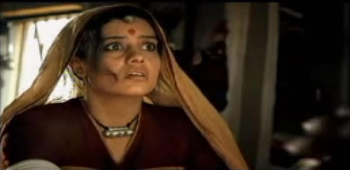
What better can a specimen can there than the hilarious ads by Camlin that made us roll on floor laughing, even before ROFL became mainstream. No matter which product was launched or featured, there were always elements that evoked laughter and most importantly increased the brand recall immensely, for there was an Indian connect in most of the ads. Talking of Indian connect, we recollect Camlin’s permanent marker ad that revolved around Indian women applying sindoor (vermillion) as a sign of their bond with the husband.
The ad is shot in a rural ambience, where the women’s husband breathes his last on the cot. As the ad progresses, local women approach to wipe off the vermillion from the widow’s forehead, but to vain; they try harder but the vermillion doesn’t go off. And guess what, the women’s husband comes back to life. Now, the flashback- the husband actually applied the vermillion with Camlin’s permanent marker. Well, just like the permanent marker, even the ad has made its place permanent in our minds and hearts and that’s the beauty of Camlin ads, they are as local as they can be, and as hilarious as you can imagine. They remember the key point of targeting ads either through emotions or humour – information takes a backseat.
That was just one of those memorable ads by Camlin, back when digital filmmaking was just evolving. And if you notice all the Camlin ads of that time, you will notice that all these ads are made out of really snack budgets and were shot in analog format. Other sidesplitting ads by the brand include the white board ads that feature people in a board room – typical corporate culture, back when it was new to India.
The thing about these ads is not just the fact they are fun to watch, it is beyond that - it is an efficient brand communication. The TV commercial’s ambience (rural India) is perfectly in sync with the setup and script. Also, the concept visualisation is creative besides being abstract. The adverts by Camlin target widespread demographics of people including: corporate, students, rural and urban population. It also establishes a differentiating feature –permanent mark - in a subjective way, subtly steering away from any controversies. Despite being a witty TVC, the content doesn't hurt sentiments of the viewer and that’s the art of advertising. All in all, the whole idea was conveyed humorously in the most subtle way possible. Let’s hope the art directors of brands wake up and make something similar, worth talking about.

© 2024 Hyderabad Media House Limited/The Hans India. All rights reserved. Powered by hocalwire.com


