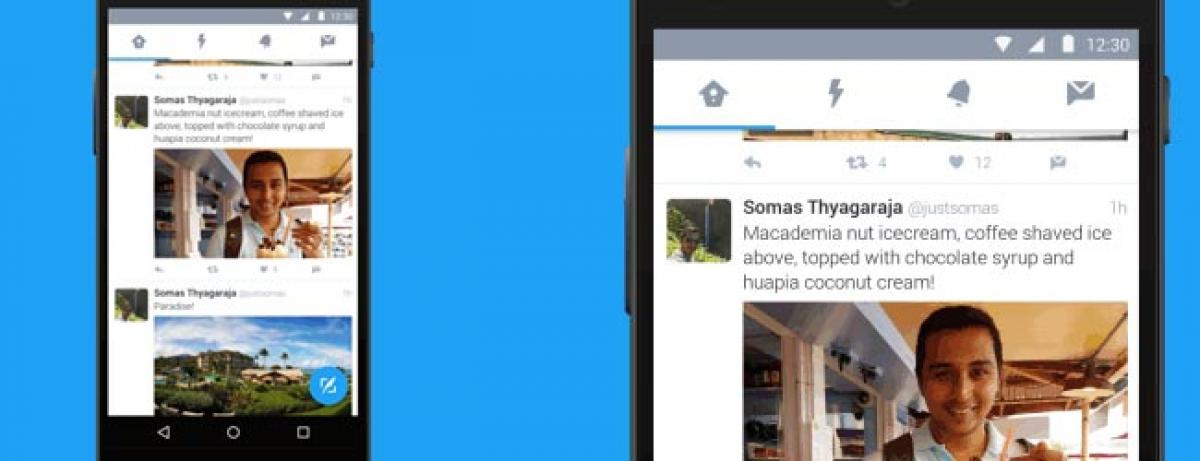
Twitter gets revamped look on Android app

Twitter gets revamped look on Android app
x
Highlights

Twitter today announced that it has updated its Android app with a new look and feel. Now the app accords with the principles of Google’s Material

Twitter today announced that it has updated its Android app with a new look and feel. Now the app accords with the principles of Google’s Material design — there is a floating circular button in the bottom right corner that lets you tweet, and there is a new drawer that lets you access your profile, settings, Highlights, Lists, and the Connect feature.

The tweet button is the obvious big action to call users’ attention to. Retweeting and liking certainly have their value on Twitter, but generation of new content that can be shared is important for Twitter users and the company as a whole.

The changes are designed to make the app easier to use, and they’re rolling out to everyone today, Twitter for Android engineering manager Maryann Vellanikaran wrote in a blog post.

source: techgig.com

Twitter was testing this new design in a beta program for the Android app a few weeks ago, Android Police and others reported.

The Material design language has been around for two years now. Facebook Messenger, eBay, Imgur, and Skype, among others, have rolled out Material design app updates, and Google has brought the style to some of its own apps, too — Google Analytics, Google Drive, Hangouts, and YouTube, to name a few. Now it’s Twitter’s turn.

Twitter doesn’t often completely change the look of its native Android app — the last time we wrote about such an overhaul was in 2013.

Show Full Article
Print Article
Next Story
More Stories
ADVERTISEMENT
ADVERTISEMENTS