YouTube Homepage Gets A New Look; Are Users Happy?

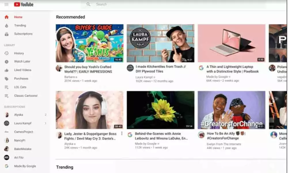
YouTube’s homepage redesign, with better visibility for videos, and it gives more importance to creators.
YouTube is receiving a significant redesign, and the new modifications will be seen on desktop, Android and iOS apps. YouTube will look for a more minimalist look with the latest update by removing unnecessary items from the homepage. The YouTube homepage will now feature larger thumbnails and longer video titles. The updated YouTube design will be implemented as of today.
If you received the new YouTube design, you would notice a distinctive change in appearance with larger thumbnails. Two rows of videos have now become one. Video titles have also become longer now with more space on the home page. To make it easier for users so that they can access them directly, YouTube is also adding channel icons along with the video title.
With more space for bigger video thumbnails, YouTube has removed some shelves of content from the homepage. YouTube homepage will have some video genres like breaking news, music mixes and more. YouTube has also come up with a short cut "add to queue" with this redesign. Users will be able to add videos to the queue directly from the thumbnail on the desktop. As before, once the browser is closed, videos saved in the queue will not be saved.
YouTube desktop is getting another feature which was initially implemented to its mobile apps. YouTube's 'Don't recommend channel' feature is now available on desktop as well. This feature is available on suggested videos and users can access it by selecting the three-dotted menu. YouTube also said it would soon introduce the selection of topics for desktop and tablets.
YouTube's homepage redesign, with better visibility for videos, gives more importance to creators. Looks like the YouTube users who are not very happy with the new design.


